Initial task
We supposed to built a validated prototype for a new search interface. It had to meet the following basic requirements:
- User centered functionality
- Match with business goals of StudyPortals
- Possibility to implement in six months
Planning
Toghether with the company we developed the plan for this proect.
- Expert Evaluation
Explore and evaluate the current interface and search functionality
- Student Evaluation
Organize usability testing with students to evaluate existing version of web site and handle basic problems and needs of users
- Design
Analysis of the data from student evaluation and design new solutions
- Prototyping
Building the prototype using html and javascript
- Prototype Evaluation
Organize second usability test and evaluate the developed prototype with students
- Final Prototype
Make changes to the built prototype according to the user evaluation
0%
Choose stage to see progress
Expert evaluation
As experts my team explored the current inteface. We made document with list of comments and problems that were found during the evaluation.

In general we believe the website provides very good opportunities for searching a master programme. The functionality is high; the website provides many opportunities to users to achieve their goals. The problems we found are therefore mostly not related to functionality, but to the design. Although the options are available, we believe a more user-centered design will convince users to use the mastersportal even more than they do now.
Besides our expert evaluation we also reviewed other websites with large search functionalities to find best practices.
Student evaluation
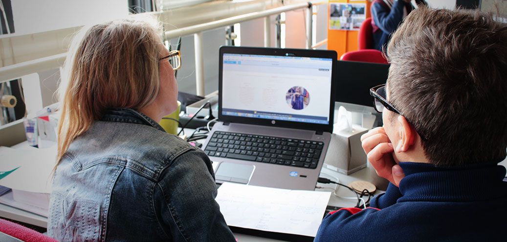
For the first evaluation we invited 9 participants (bachelor and master students) from Technical University of Eindhoven. They were from different countries around over the world. We had participants from Brasil, US, France, Finland, India, Iran, Thailand, etc. This mixture helped us to get broad results according to difference sin cultures.
Because we invited students as participants we asked them to search for program that they could be interested in. They felt free to search without any additional instructions. We used thinking aloud method for testing. Indeed, we recorded screencast and audio to analize this material later. After the test we asked participants additional open questions, comments and suggestions.
Design
We analized the data from usability test and split all the data in four categories:
- Likes
We wanted to pay attention what people like in the current interface and leave it or even improve.
- Dislikes
Some things most people did not like. For instance, moving advertisement or how search results were represented.
- Problems
We analized problems that participants faced with. For example, some of them spent a lot of time to find appropriate program but in the end they could not do it.
- Suggestions
At the end of testing we asked participants for suggestions. For instance, what they missed mostly during the searching

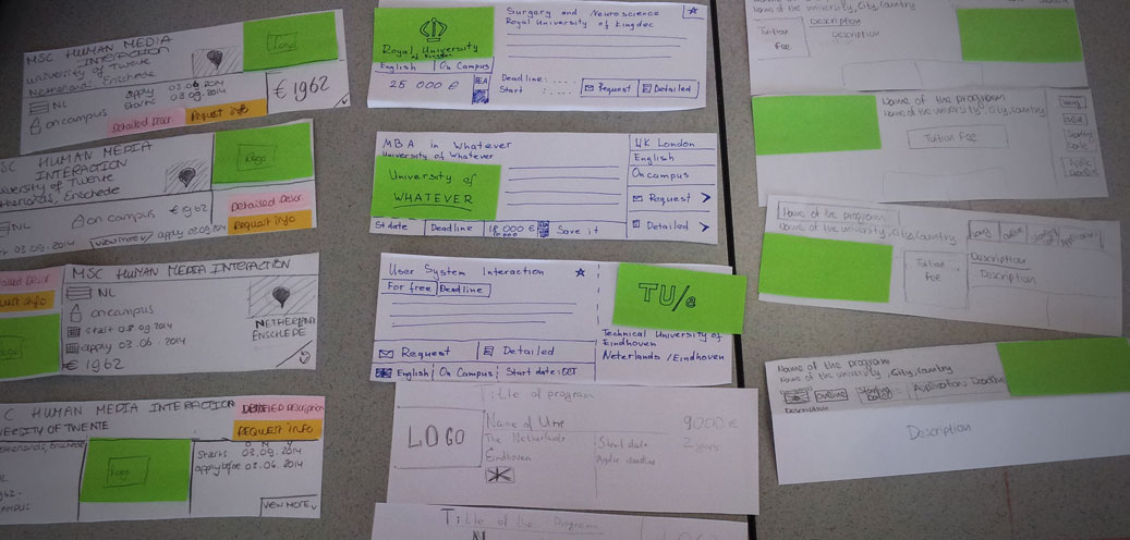
Of course, all these data helped us with designing. We started from scratch with new interface. Company wanted to leave us current search functionality. So we could not improve search it self but we could improve interface and interactions.
Actually, I think the key success can be achieved only with smart search. Search engine should guess what user is looking for and success measures how often the machine knows what to answer to a request.
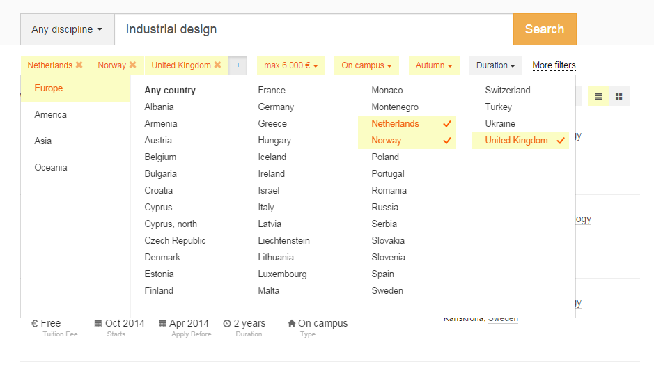
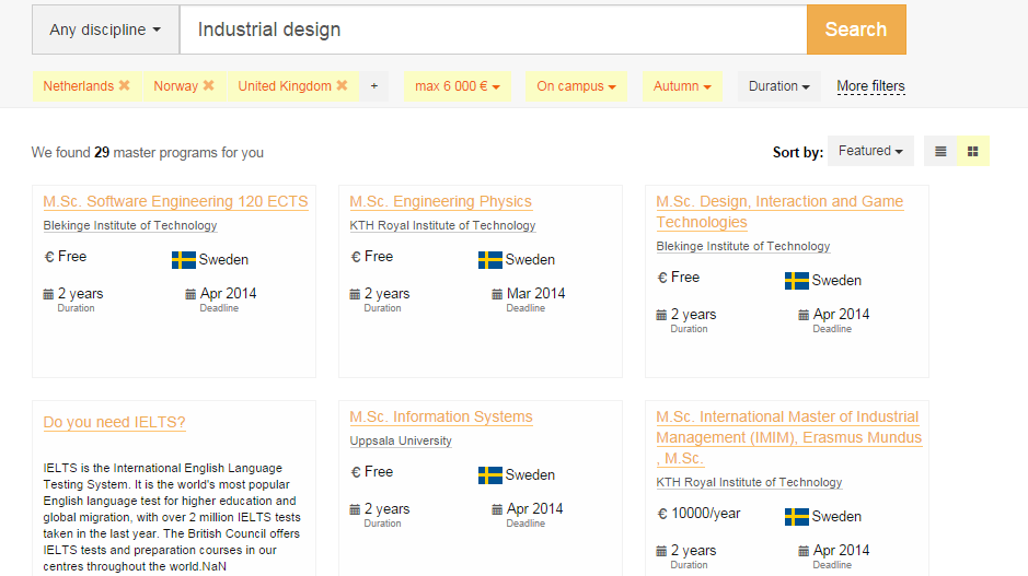
From interface perspective, we wanted to do something simple that is why we placed all filters beyond the search bar. Most websites that are focused on searching educational programs keep filters in the left part because there are a lot of options to select.
The participants used only 25% of these filters for a fisrt iteration of search. That is why we hided some filters and left only important for users.
Prototyping

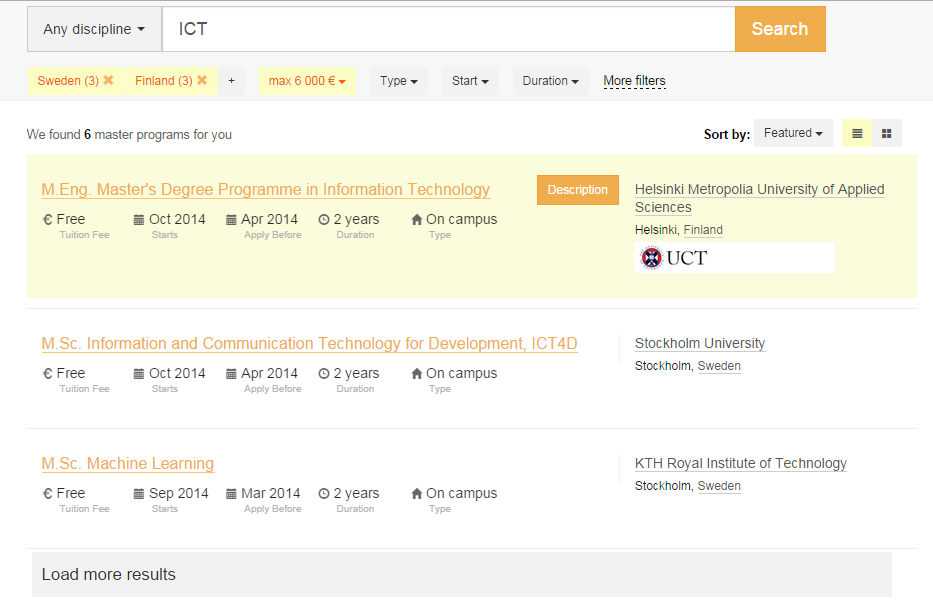
All these solutions we implemented in the prototype using HTML and JavaScript. I asked developers from StudyPortals to give us fragment of the real data in JSON format. Usage of this data in the prototype gave us opportunity to evaluate it with the same scenario. I think it is incredibly important.
The prototype is fully responsive, even it can search for programs. All links go to the current website but that is just because we were focused on search experience.
Prototype evaluation
We avaluated the developed prototype with 5 participants with the same technique as previous evaluation. Some of participants joined the first usabilty test with the current interface. They found new version much lighter and easier to interact. We noticed that time for searching program decreased as well.
The results from this evaluation helped to make final changes in the prototype.


